— Adobe Illustrator, Photoshop, PowerPoint/KeyNote
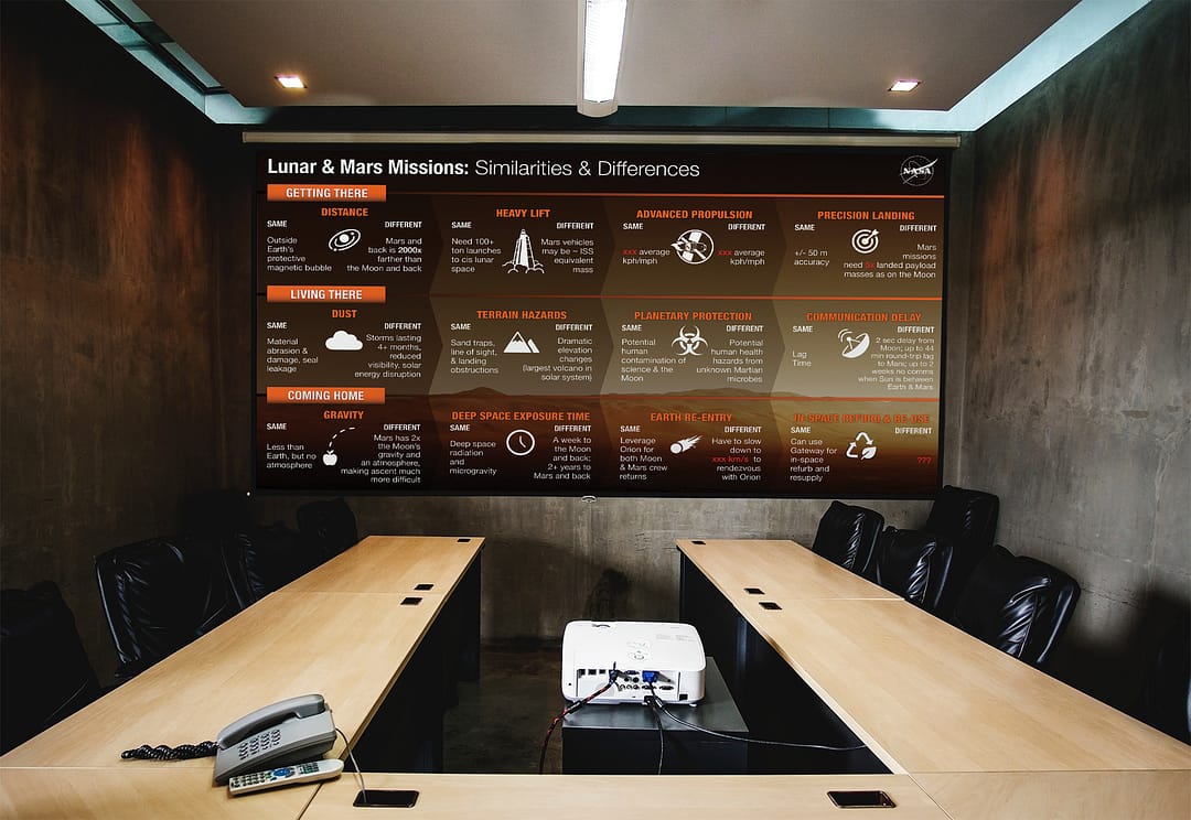
This project is a collection of infographics for use in presentations both internal and external to NASA. These informational slides were first used by M. Rucker at Johnson Space Center on August 5, 2021.
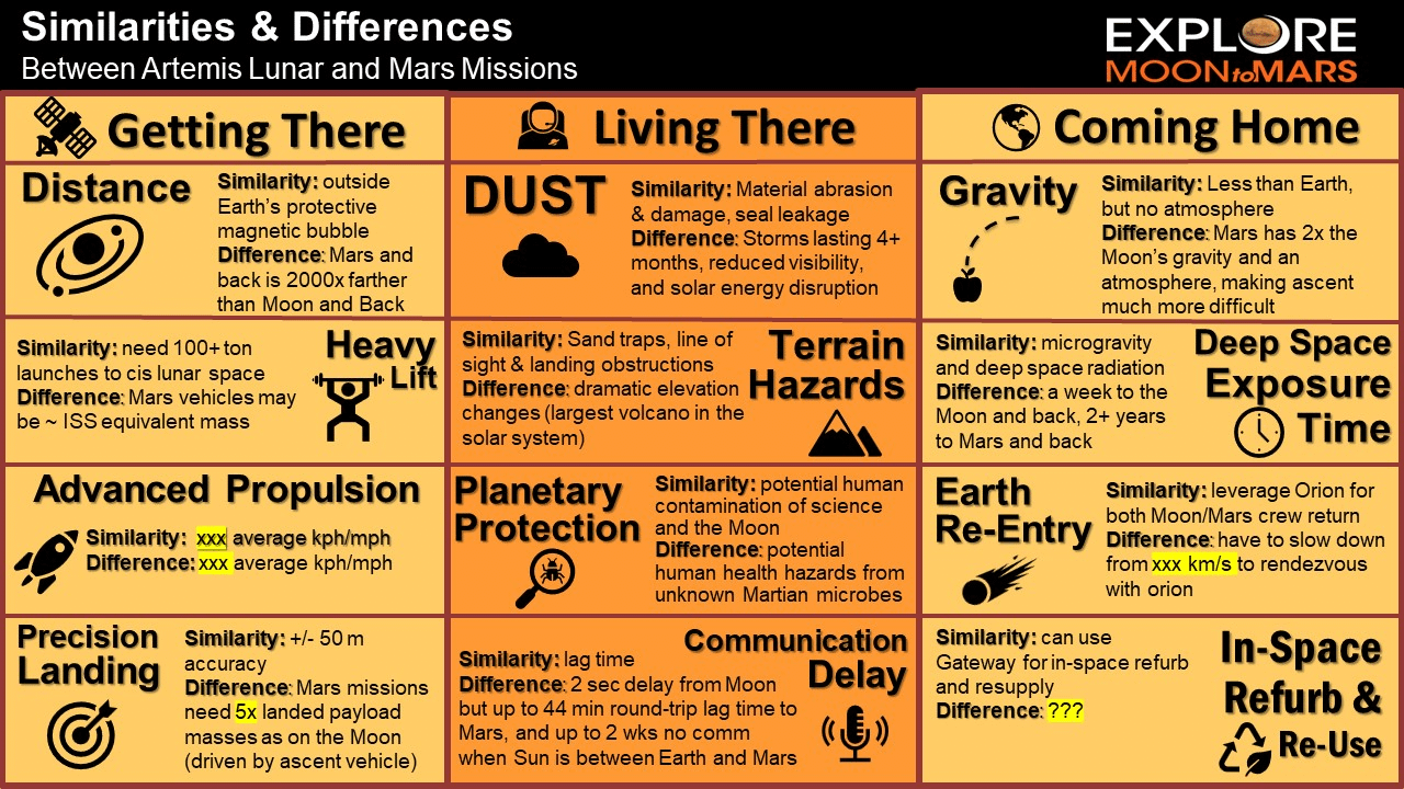
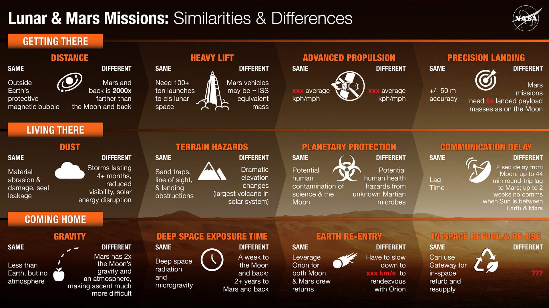
The main purpose is to compare and contrast challenges between missions to the Moon against missions to Mars— as you can imagine, there is a lot of information to cram onto these slides!
PLEASE NOTE:
This project was created during an internship with NASA’s Artemis Communications Team. Some images may not be representative of the final release, which may have occurred after the end of the internship.
Many of the projects I completed with NASA have been or will be used for educational purposes, for stakeholder presentations, and for communication between different departments throughout the agency.
Specific details on the images below may be missing or may change.
The viewer’s eye is guided from left to right by the bold headers and high contrast on the left side of the screen, gradually lightening as we move through the information.
Custom icons I made (Heavy Life, Advanced Propulsion, Communication Delay, Earth Re-entry) were used alongside icons created by another NASA designer for the original infographic.
Below is a comparison between the original infographic (left) and my new redesign (right).
Enjoy!